Categories
Tags
-
#Social Media Marketing
#Duct Cleaning
#Roofing Repairs
#roof damage
#auto transport
#Warehouse Equipment with Gas Struts
#Mountain Bike Goggles
#Locksmith in Lake Worth
#Understanding Water Damage Cleanup
#mold in homes
#Hospitality-Style Office Art
#Annual Reporting and Audit Requirements
#Bottlenecks In Dropshipping
#Corporate and Chauffeur
Archives
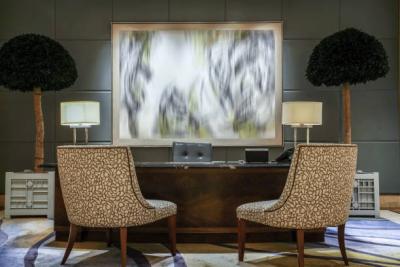
Hospitality-Style Office Art: Hotel Calm for Workday Flow
-
Think about the most soothing hotel you have visited: the lighting feels gentle, the palette is balanced, and every detail looks intentional. That “hotel calm” is not an accident. Hospitality designers reduce visual noise so guests can exhale, reset, and move through the space with ease.
You can borrow the same approach for office decor. The right office wall art helps meetings feel steadier, makes collaboration feel less frantic, and gives your workday a clearer rhythm. This guide shows how to choose canvas prints and wall art prints that create a refined, hospitality-inspired atmosphere—calm enough for focus, polished enough for clients, and warm enough for everyday comfort.
What “Hotel Calm” Means in Office Wall ArtVisual quiet that still feels elevated
Hotel calm is not the absence of personality. It is curated restraint: clean compositions, balanced contrast, and a sense of breathing room. In practical terms, hospitality-style artwork tends to share three qualities:
- Soft structure: shapes that feel organized without looking rigid.
- Measured contrast: details that read clearly from a distance without shouting.
- Intentional negative space: areas of calm that let the eye rest.
What disrupts workday flow
Some artwork is exciting in a gallery setting, but distracting in a workspace. When your goal is hotel calm, avoid pieces that feel visually crowded: overly dense patterns, competing focal points, or high-contrast chaos that keeps pulling attention away from tasks and conversations.
Color Directions That Feel Like a Well-Designed HotelWarm neutrals for welcoming energy
Warm neutrals create comfort without feeling sleepy. Think sand, clay, soft beige, creamy off-white, and gentle taupe. These tones pair beautifully with wood, soft gray upholstery, and matte black details. Warm palettes are especially effective in client-facing areas because they feel inviting while staying professional.
Cool neutrals for clarity and spaciousness
Cool neutrals (fog gray, stone, muted blue-gray) can make a room feel visually larger and cleaner. They work well in meeting rooms, corridors, and focused work zones—places where mental clarity matters more than cozy warmth.
The “one accent” rule
If you want a modern decor look, use a single accent family (muted blue, deep green, soft rust) and repeat it subtly across your space. This creates cohesion without turning the office into a collage.
Art Styles That Support Steady FocusAbstract canvas art with gentle movement
Abstract canvas art is a hospitality favorite because it can suggest motion and emotion without forcing a story. Look for fluid forms, soft gradients, minimalist linework, and balanced geometry. In an office, these pieces read as modern and intentional—without distracting from work.
If you are building a calm focal wall, start with curated abstract canvas art that uses restrained contrast and a disciplined palette.
Nature themes that reset attention
Nature imagery is a natural partner for workday flow. Landscapes, botanical compositions, and serene horizons offer an instant mental reset—especially helpful in high-traffic areas or spaces where people transition between tasks.
For a softer, restorative mood, consider a nature canvas print with gentle tones and simplified detail that still reads clearly from across the room.
Travel and architectural calm (without visual clutter)
Travel-inspired artwork can feel sophisticated when it is minimal: quiet streetscapes, simplified skylines, or architectural forms with clean lines. The key is choosing images that feel spacious rather than busy.
Modern linework and soft geometry
Line art and geometric pieces are excellent for offices because they complement modern furniture and clear layouts. Choose pieces with generous negative space, subtle texture, and controlled contrast to keep the atmosphere calm.
Placement Guide for Smooth FlowBehind desks: a calm focal wall for focus
The wall behind a desk is a daily backdrop for decision-making—and often for video calls. Choose one primary piece that communicates calm authority. Keep the palette aligned with the room, and avoid artwork with tiny, busy detail that can flicker on camera.
Reception and entry areas: first impressions without noise
Hospitality-inspired entry design is about welcome and confidence. Choose a single large artwork or a clean pair that feels intentional. The goal is to guide the eye, not overwhelm it.
Hallways: rhythm through repetition
Hallways feel “hotel-like” when spacing is consistent. If you hang a series, keep sizes aligned and maintain even gaps. This creates a corridor flow that feels planned and refined.
Conference rooms: fewer pieces, clearer presence
In meeting rooms, the wall should support attention, not compete with it. A single large piece often works better than a busy gallery wall. Choose artwork that reads from the farthest seat and stays calm at close range.
Break areas and lounge corners: gentle reset zones
These spaces can handle slightly softer themes—nature, calm abstraction, or warm neutrals. The goal is to help people downshift quickly, then return to work with more clarity.
Size, Layout, and Spacing Like Hospitality DesignOne hero piece vs. a planned set
Hotels often use a hero artwork to anchor the room. Offices can do the same. A large wall art piece makes the space feel designed, especially when furniture and lighting are simple. If you prefer multiple pieces, keep the set disciplined: same orientation, consistent spacing, and a shared palette.
Simple sizing rules that work
Use these hospitality-style guidelines to avoid under-scaling:
- Aim for artwork that covers roughly two-thirds of the wall width above furniture.
- Hang the center of the main piece near eye level for a standing viewer.
- Keep consistent spacing between pieces to maintain a clean, designed rhythm.
Multi-panel layouts for modern offices
Multi-panel wall hangings can create a refined, contemporary look—especially in boardrooms and long corridors. The secret is restraint: pick one image family and keep the palette quiet so the panels feel cohesive, not chaotic.
Choosing the Right Format: Canvas Print vs. Art PrintWhen a canvas print fits best
A canvas print adds texture and depth—often without the need for additional framing—making it a practical choice for offices that want a polished look with minimal maintenance. Canvas also tends to feel softer than glossy surfaces, which helps reinforce the hotel calm mood.
When an art print makes sense
Art prints are a strong option when you want a crisp, gallery-like presentation with matched frames, especially for sets in hallways or smaller offices. If you prefer strict uniformity across multiple rooms, framed art prints can make that easier.
Building a Hotel-Calm Office Wall With Artesty
Hospitality style works best when it is curated—fewer pieces, better chosen. Artesty’s approach is rooted in modern and contemporary aesthetics, with an emphasis on premium canvas construction and careful presentation. The brand story is personal, too: the studio is family-run, shaped by a long-standing love of design and the craft of transforming rooms with art.
If your first step is refreshing a core workspace wall, start with office wall art that supports focus through balanced design and clean compositions.
Artesty canvas prints are described as printed on natural canvas with high-quality ink, carefully hand-stretched on sturdy wood panels, and packaged for shipment—details that matter when you want office decor that looks intentional and holds up well over time.
A 15-Minute “Hotel Calm” Wall Plan
- Choose one mood: warm neutral comfort or cool neutral clarity.
- Pick one hero wall: behind the main desk, in the meeting room, or at reception.
- Select one theme: calm abstract, soft geometry, or nature-forward imagery.
- Decide the format: canvas prints for texture, art prints for framed uniformity.
- Measure quickly: target about two-thirds of the wall width for the main piece.
- Hang at eye level: center the artwork where it reads naturally in the room.
- Repeat one accent: a subtle color thread that appears elsewhere in the office.
Recommendations for a Hospitality-Style Office Refresh
- Start with one calm focal point: one large piece is often more effective than many small ones.
- Keep contrast measured: clarity matters, but high-contrast chaos can disrupt focus.
- Repeat a palette: reuse one neutral family across multiple rooms for cohesion.
- Use sets only when disciplined: same sizes, consistent spacing, shared tone.
- Prioritize the meeting room wall: it affects attention and perceived professionalism.
- Design the corridor rhythm: even spacing creates a boutique hotel feel.
- Choose calm themes for break zones: nature and soft abstraction reset attention quickly.
- Think in “zones,” not rooms: focus zones, transition zones, and reset zones can share a visual language.
FAQs: Hospitality-Style Office Art1) What makes office wall art feel “hotel calm”?
Balanced composition, controlled contrast, and generous negative space create a refined atmosphere that supports focus.
2) Is one large canvas print better than multiple smaller pieces?
Often, yes. A single hero piece looks intentional and reduces visual clutter, especially in meeting rooms and focused work areas.
3) What colors work best for hospitality-style office decor?
Warm neutrals feel welcoming; cool neutrals feel crisp and spacious. Both work well when you keep accents limited and consistent.
4) Which art styles are least distracting during work?
Soft abstraction, minimalist linework, calm landscapes, and gentle geometry tend to support steady attention.
5) How do I pick artwork for video-call backgrounds?
Choose a piece with a clear focal area and minimal tiny detail. Keep it aligned with your palette so it reads as intentional on camera.
6) Where should I hang art in a conference room?
Place one calm focal piece on the main wall—where it is visible from most seats—without competing with screens or whiteboards.
7) What is the simplest hallway strategy?
Use a short series with consistent sizing and equal spacing. Repetition creates hospitality-style rhythm.
8) How do I keep multiple rooms consistent without repeating the same image?
Repeat the same palette and style cues across rooms—similar tones, similar contrast, similar composition—while varying the subject.
9) Should office artwork match furniture colors exactly?
Not exactly. Aim for harmony: echo one or two tones from furniture, then let the art add soft variation.
10) What size should I choose for a focal wall?
Aim for artwork that fills about two-thirds of the wall width above furniture, then adjust based on ceiling height and viewing distance.
11) Are multi-panel wall hangings a good fit for offices?
Yes, when the design is calm and the spacing is consistent. Multi-panel layouts can feel modern and architecturally clean.
12) What themes feel calm but still professional?
Neutral abstract forms, soft geometry, minimal architecture, and simplified nature imagery are all strong professional choices.
13) How many pieces should I hang in a small office?
Usually one well-chosen piece is enough. If you use two, keep them coordinated and leave generous breathing room.
14) How do I avoid making the office feel too sterile?
Add warmth through neutrals, gentle texture, and one restrained accent color—then keep layouts clean and consistent.
15) What is the fastest way to get a hospitality feel with minimal changes?
Pick one hero wall, choose a calm palette, and hang one large, balanced piece at eye level. That single change often shifts the entire mood.
Closing: Make Calm a Daily Design Decision
Hospitality design succeeds because it respects attention. When you bring that mindset into the office—calm palette, disciplined layout, and artwork chosen for clarity—you create a space that supports workday flow instead of fighting it.
Start with one hero wall, keep your palette consistent, and choose pieces that feel quietly confident. Over time, you can expand the same visual language into hallways, meeting rooms, and lounge corners—until your office feels as steady and welcoming as a boutique hotel.